Pivot Tables and Pivot Charts are tools that can help you summarize, explore, and visualize your data quickly and efficiently. Pivot Tables provide summaries in tabular format while Pivot Charts summarize this in graphical formats. As the names suggest, Pivot Charts are created from Pivot Tables and Pivot Tables can be created from a Power Pivot model as well as a worksheet table or range, and external data source.
Using Pivot Tables
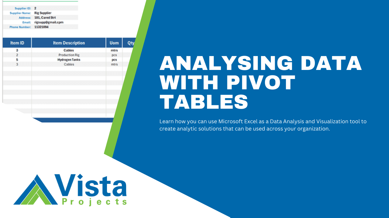
A Pivot Table is different from a regular table as it allows you to quickly summarize large datasets, rearrange, filter, and group data without altering the original data set.
How to Create a Pivot Table from a Power Pivot Data Model
- Navigate to the “Insert” tab and select “PivotTable”
- If you already have data loaded to Power Pivot, select “From Data Model”
- Decide whether to place the Pivot Table in a new worksheet or an existing one
How to configure a Pivot Table
A “PivotTable Fields” panel will open on the right. This field list panels contains all objects (tables and queries) that you can use as data sources for the pivot table. It also has areas where you can drag table fields into.
- Filters Area – Drag data source fields/columns that you want to use as filters.
- Columns Area – A pivot table has rows and columns, drag source fields that you want arranged horizontally.
- Rows Area – Just like columns, drag source fields that you want arranged in rows.
- Values – Drag source fields that you want to aggregate. You can also choose different aggregation functions like Sum, Average, Count, Max, and Min.
Watch the video below to see how you can create Pivot Tables from a data model.
Using Pivot Charts
Pivot Charts are graphical representations of data summarized in Pivot Tables. They provide a simpler of viewing tabular data so that it is easier to see trends, patterns, and comparisons in your data so that you can quickly interpret and present your results.
To create a Pivot Chart, select a Pivot Table, in the “Insert” tab under the “Charts” group, select “PivotChart.” A dialog box will appear that allows you to choose the kind of chart you prefer.
How to choose the right chart for your data
The type of chart you choose depends on what message you want to communicate from your data. For example, when showing comparison, a bar chart or column chart are best suited for showing comparing categories. When you want to show total procurement spend by category, since each bar/column might have a different height, this can be quickly interpreted as either being more than or less than. Choose a bar when the category names have long text or cannot all fit well in a column chart.
When showing Trends or continuous time periods, select a line chart. For example, the sales trend per month. If the line has a continuous drop from month to month, this can be quickly interpreted as a drop in sales and vice versa.
When showing proportions of a whole, choose a pie or doughnut chart. For example, when you want to show the percentage of open and closed orders out of all orders. However, if the proportions being compared have a large count, consider using a column or bar chart to avoid clutter in the pie or doughnut chart.
Categorical data types are suited for bar, column, pie, or stacked charts. Numerical data types are best displayed using line, scatter, bubble, or histogram charts. A time series is quickly interpreted using line, area, or column charts.
When your analysis goal is to show comparison, choose a column, bar, or line chart. If you want to analyze the distribution, use a histogram, box plot, or scatter plot. If you want to analyze the trend over time, use a line or area chart. When analyzing proportions, use a pie, doughnut, or stacked charts and when analyzing the relationship between in your data, use scatter or bubble charts.
Here is a summary of the most common chart types and when to use them.
| Chart Type | When to Use |
| Bar Chart | Comparing different categories or groups. |
| Column Chart | Comparing data across discrete periods or categories. |
| Line Chart | Showing trends over time, especially for continuous data. |
| Pie Chart | Showing proportions or percentages of a whole. |
| Area Chart | Emphasizing the magnitude of change over time, showing cumulative totals. |
| Scatter Plot | Displaying the relationship or correlation between two numerical variables. |
| Bubble Chart | Showing relationships between three variables, with bubble size adding another layer of information. |
| Stacked Bar Chart | Comparing the total and the parts that make up the total across categories. |
| Stacked Column Chart | Comparing the total and the parts that make up the total across time periods or categories. |
| Heat Map | Showing the magnitude of values across two dimensions, identifying patterns and hotspots. |
| Waterfall Chart | Visualizing the cumulative effect of sequential data points, such as financial statements. |
| Histogram | Showing the distribution of a single continuous variable, identifying the shape of the data distribution. |
| Box Plot | Displaying the distribution, median, quartiles, and outliers of a dataset. |
| Gantt Chart | Tracking project timelines, schedules, and task dependencies. |
| Radar Chart | Comparing multiple variables or categories on a radial axis, useful for performance analysis. |
| Funnel Chart | Visualizing stages in a process, such as sales pipeline or conversion rates. |
| Treemap | Showing proportions and relationships in hierarchical data. |
| Sunburst Chart | Visualizing hierarchical data as concentric circles, showing relationships and proportions. |
| Gauge Chart | Displaying performance metrics against a target, such as KPI achievements. |
Looking for project-driven supply chain management software?
Current SCM is the first of its kind – supply chain management software purpose-built to support the most complex procurement and materials management projects. With materials management and vendor document requirements uniquely integrated into the order, Current SCM provides a unified, collaborative platform to streamline the end-to-end process of project-driven procurement and materials management.
If you are engaged in any direct procurement, technical procurement, project procurement or third-party procurement, Current SCM will improve your procurement and materials management workflow. If you are engaged in all four, Current SCM will revolutionize the way you do business.
Contact our sales professionals at Current SCM today!